Logos for download in PNG and SVG formats
Logo guidelines
Primary logo
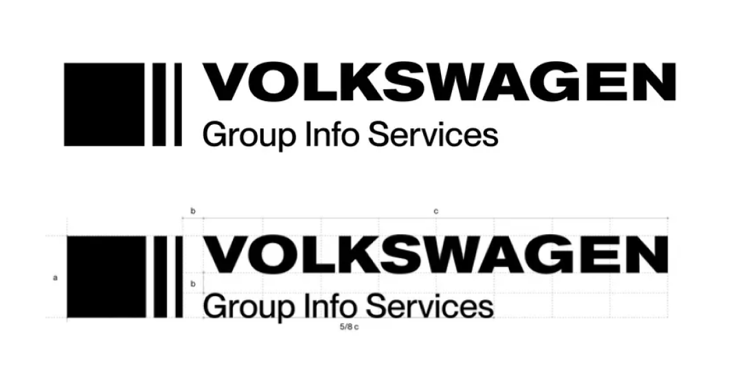
The primary logo of VW GIS AG is composed of a wordmark and a figurative mark. It combines two primary typographies in stark contrast to one another to highlight the hierarchies within the brand. It is a balanced and distinctive mark in which the user can easily identify the position of each word.
This is the main logo that will be used across primary applications to represent the brand. It is essential to the success of the brand that use of the logo respects these document guidelines at all times.
Secondary logo
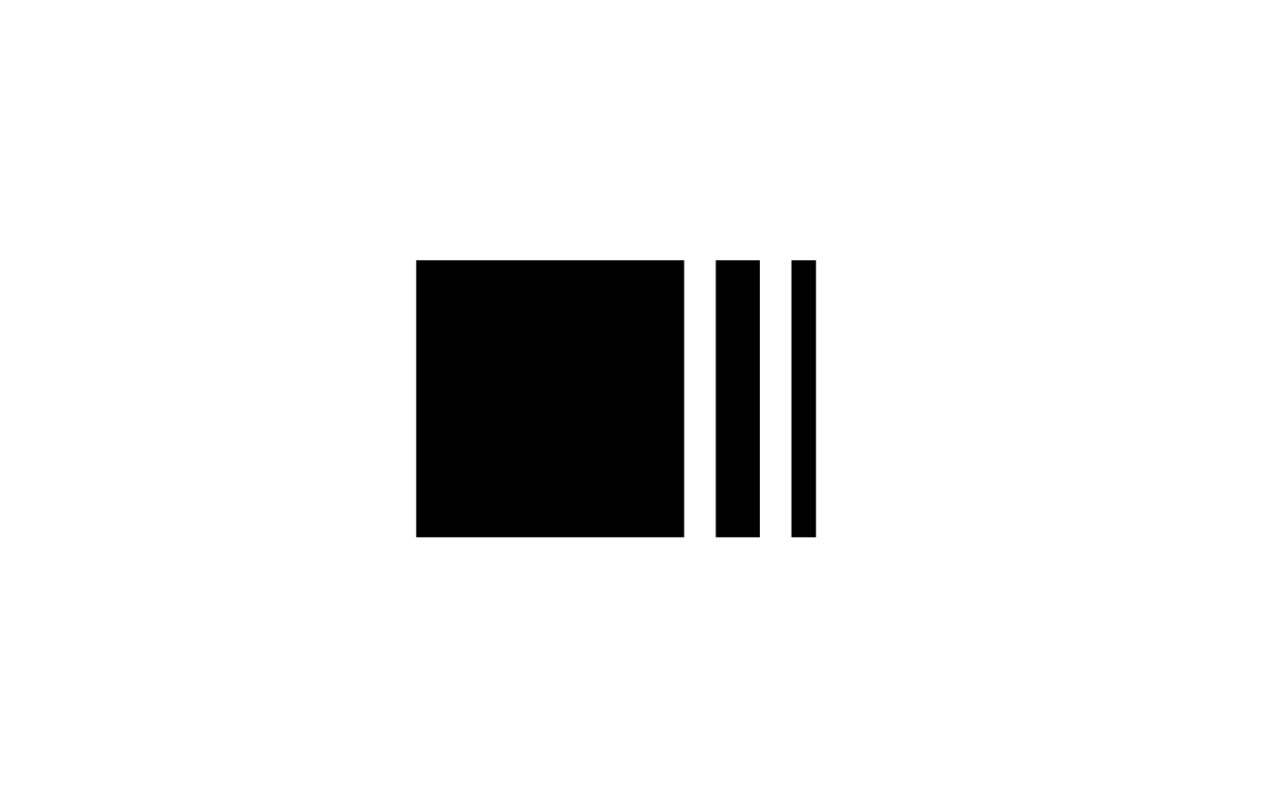
This iteration is a simplified version of the primary logo. It is the standalone version of the mark. It should be utilised only according to this guide and in the case that the main logo cannot, or when the desired outcome is a concrete visual result.
The mark chosen to support VW GIS’s wordmark represents a reduction of a bar, derived from the the bars painted on street crosswalks and urban settings.
This shows the connection to mobility, moving forward, and transformation in a minimalistic way.
Safe space
To protect the clarity and visual integrity of the logo, its exclusion distance should be respected.
This distance to other elements equals the height and width of the figurative mark. This rule applies to all size variations.

Minimum size
The primary logo should never be smaller than 100 px (height) in digital formats and 12 mm in print. If a smaller version is needed, please use a secondary logo.
This secondary logo should never be smaller than 30 px (height) in digital formats and 12 mm in print.

Color applications
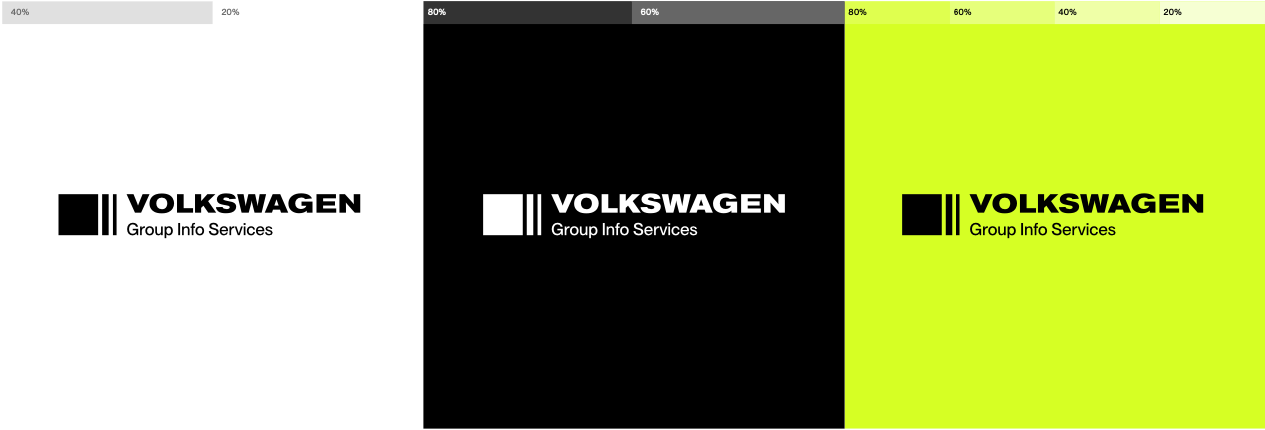
The black logo should be used on light-colored backgrounds and the white logo should be used on dark-colored backgrounds. It is also possible to use the logo in neon green if a certain look is desired for a special occasion.
Primary usages are as displayed below.
The logo should always be placed on a contrasting background where visibility is not compromised.
Incorrect usage
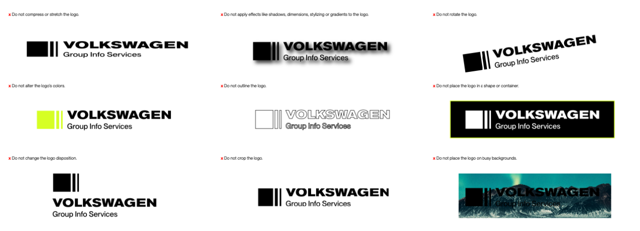
To ensure a correct and safe use of the logo, please follow these rules accordingly.
Background applications
There is not a strict guide on how to position the logo. It can be any size or position within the layout. It can be overlaid on block colors and images. However, it should always be perceived clearly and distinctly, keeping the exclusion distance tonother elements like typography or other logos.
